MY TWO WEEKS IN ITALY PRINTING THE BOOK
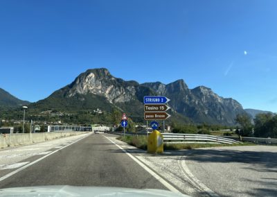
On September 28, 2021, I departed New York for Milan, Italy, to oversee the printing and production of my long-awaited Vanishing Cuba book. I was headed to my printer, Longo AG, in Bolzano, Italy. My man at Longo, Giuseppe, picked me up at the airport, and we began our four-hour journey across Northern Italy. Giuseppe had been working with me for two years on this project, and he knew exactly what I was looking to achieve. After multiple espressos stops along the Autostrade, we arrived at Longo in the late afternoon. The espresso stops were a good indication of what was to come. Non-stop espresso, all day, every day, for the next two weeks!
Our first piece of business was to agree on the separation process for the books 300 showcased photographs. Since we were using a complex printing process of 7 colors and 3 blacks, we wanted to make sure that the separation screen definition would support it and deliver the results we were looking for. Martin, the head of pre-press, with his ice-blue eyes, gentle personality, and long white (mad-scientist) lab coat, provided me with the confidence I needed to make the right decision.
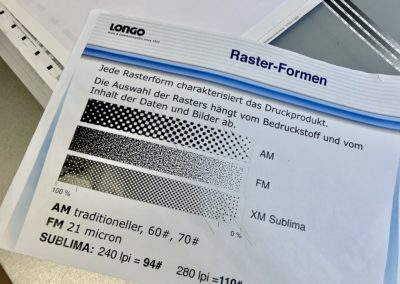
I had already approved Longo’s Epson color proofs for all the images, which beautifully matched the prints off my calibrated Canon 12-color Pro-1000 printer. So we already knew that we were off to a good start. Achieving great separations was the final goal. The next step was to decide which line screen to use. Everything that is printed needs to be separated using a line screen, and line screens create dots. Newspapers, for example, use a very course line screen because they are printed inexpensively and at very high speeds. With these, you can visibly see the dots. Even TVs use line screens, called pixels, and if you get close enough to your TV, you can see the pixels. It’s the same concept.
But where are the dots? There are no dots? The result—the images have the quality of photographs.
We decided to use a very advanced process for the line screen called FM Raster 21 Micron. Now I know that I’m getting technical with you here, but please stay with me because we are doing something revolutionary.
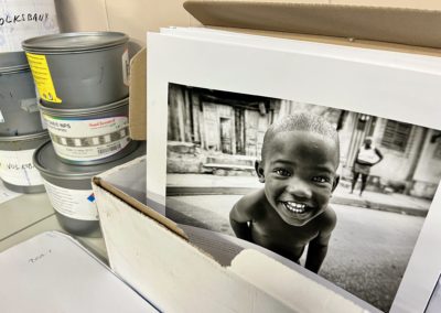
Instead of a traditional, visible grid of dots, the dots are scattered and subtly printed. The result—you can’t see any dots. Even looking through a 4x or 8x loop. The images have the quality of photographs. This process is difficult to achieve with 4-color, yet Longo was up for the challenge with 10-color. Now I knew that we were about to produce something truly unique and very special.
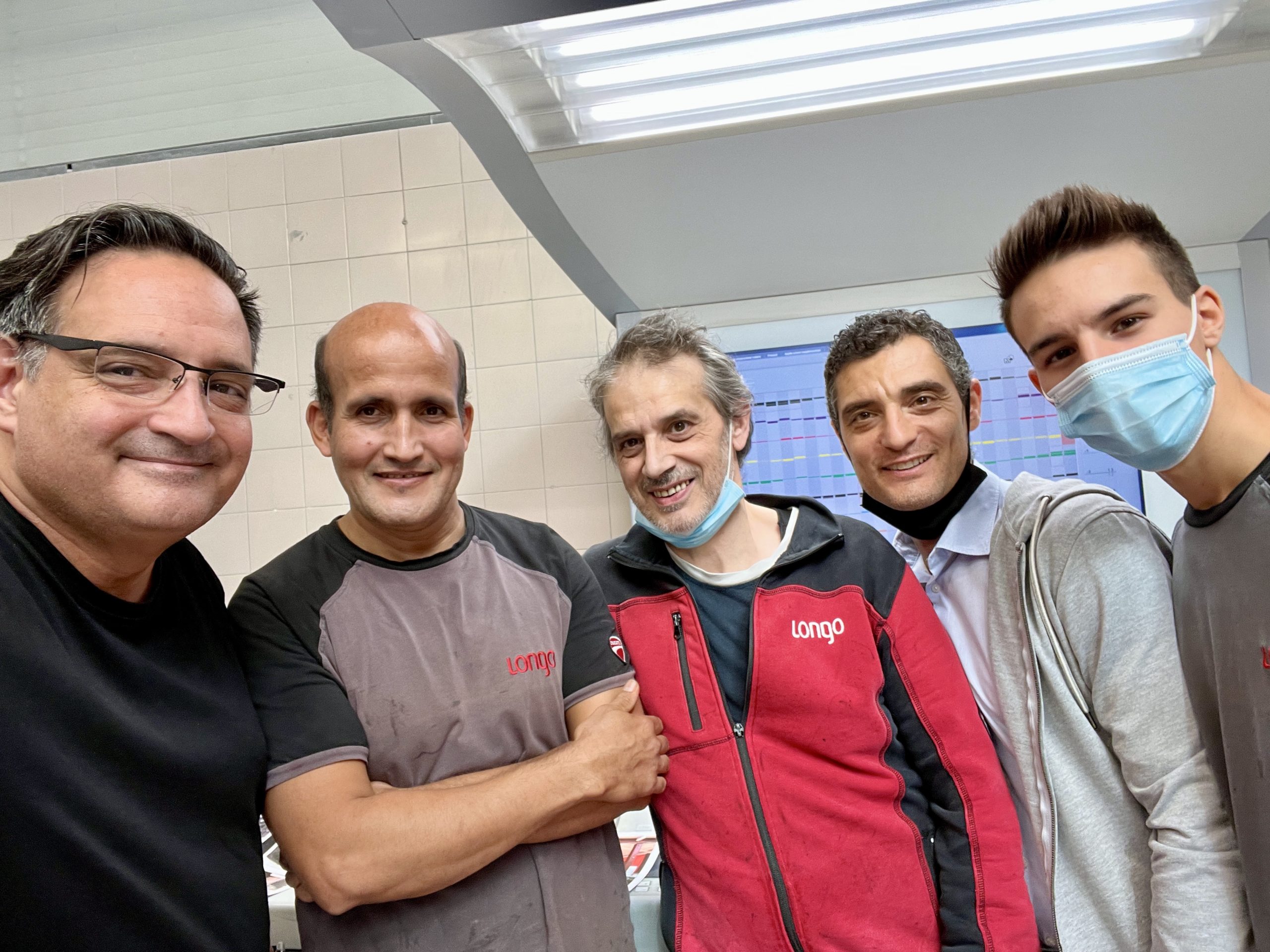
More Espresso, please!!!
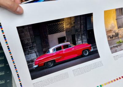
Please allow me to step back for a moment and explain why I decided to print using 10-colors when 99.9% of all color printing uses the standard 4-color (CYMK) process. When I set out to publish this book, the reproduction of my color and black and white photographs was very important. As a designer and photographer, my goal was to come as close as possible to matching the resolution, color vibrancy, and depth of digital displays. I decided early on that I wasn’t going to create a book if the images were going to die and fall short, like so many other books I’ve seen.
By teaming up with Longo, I was given the opportunity to use their newly developed 7-color printing process called Spectra7 (CYMK + orange, purple, and green), as well as a 3-black process called Triton (2 blacks and a grey). Spectra7 widens the color space by about 30%. This allows for 90% of all PANTONE colors to be reproduced on press, something that has never before been achieved. This resulted in a total of 11 colors when we included a clear varnish necessary to protect and enhance the images and inks. For Spectra7, Longo uses a Heidelberg Speedmaster XL 10-color press, one of the finest presses in the industry.
You can’t print 11 colors on a 10-color press.
This all sounds great, doesn’t it? Except we had one problem. You can’t print 11 colors on a 10-color press. In February, I asked Longo if we could share the black (K) ink from the Spectra7 with one of the blacks in the Triton? That black would cross over to both processes and free up one channel. The answer, in theory, was yes, except the process didn’t exist to make this possible. It had never been done before. Longo discussed the project with Heidelberg (Germany), and they agreed to run a test. This meant redesigning their pre-press and printing process specifically for the Vanishing Cuba book. Not only was I honored, but I was also elated that these two companies believed so much in the book that they were willing to do a test. Many thanks to Harald Longo, the driving force behind Spectra7, and for his confidence and ultimate belief in the Vanishing Cuba book.
On Press
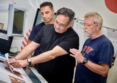
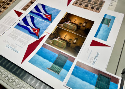
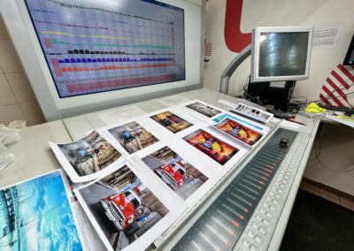
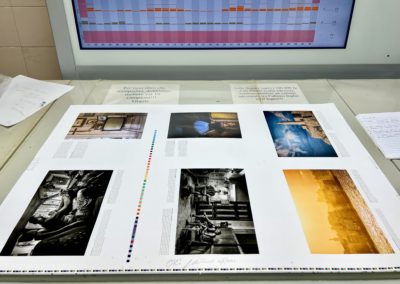
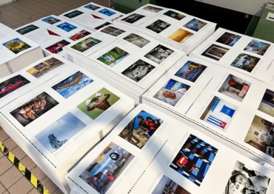
After eight straight days and 116 hours on press, we finished printing the book on Thursday evening, October 8. Perfection only comes to those who strive for it. I can tell you that the results exceeded even my expectations. We began our days at 7:30 AM and ended every day in the late evening, sometimes after midnight. Some days the presses ran during the night. Every two hours we would print another sheet consisting of 6 pages. 348 pages and 316 images is a lot of printing. On the last day, I watched the first truck depart for the bindery with the printed pages.
The orange signage at the top of this post reads, “you can do or say what you like.” The sign is located in my hotel’s elevator lobby, and something I saw three to four times a day during my 14-day stay in Bolzano, Italy. It seemed extra appropriate to read this while I was publishing my first book. On the last day, I said goodbye and took a photo of it.
Off to Treviso for packaging
After a relaxing weekend in northern Italy’s Dolomite mountains, we departed on Monday morning to visit our packaging team in Treviso (just outside Venice). Owner Roberto Fossaluzza, from La Cartotecnica Fossaluzza was there to greet us while we reviewed the book’s Deluxe and Reserve Edition packaging. The samples were beautiful.
La Cartotecnica Fossaluzza is known for the fine packaging they create for some of Italy’s top brands. I was blown away by what I witnessed. Not just with what they are doing for the Vanishing Cuba book, but with the workmanship and attention to detail. Each piece is handcrafted. They have an enviable client list that includes Ferrari, Channel, Gucci, Fendi, Lamborghini, Louis Vuitton, Chanel, Dior, BVLGARI, Audemars Piguet, Van Cleef & Arpels, and now Vanishing Cuba! A big “Grazie Mille” to Roberto Fossaluzza for his excitement and commitment to my Vanishing Cuba project. I can’t wait for everyone to see these works of art.
Next stop, Milan for the bindery and book signing
On Tuesday, we were up early to complete a last-minute addition to the Reserve Edition. Something I had come up with a few weeks back. I won’t say what it is, but it’s a lovely addition to this limited collectors edition. Soon after, we began our road trip to Milan to meet with our bindery, Legatoria C&G S.r.l., the final leg of the journey. Owner Mattia Cova was there to greet us as we watched the steps of the bindery process. It was great to see the printing sheets getting folded and the book coming to life.
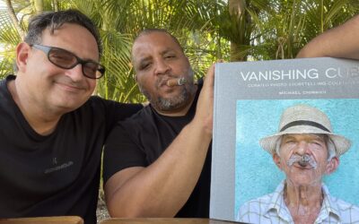
Here I would approve the final versions of the Silver, Deluxe and Reserve Editions and sign my name 1200 times across all three editions. Everything went smoothly, including approving the hot-foil stamping of the covers and signing the books. By nightfall, we were finished. Wow! We did it! I wished my awesome team from Longo, Giuseppe, and Benny, a farewell and prepared for my return to New York.
Printing the book in Italy
Many of you may not know this about me, but I returned to my roots by going on press and approving every aspect of this book. I started my career as a young designer and art director, going on many press runs for clients. So this was nothing new for me, although it had been almost 20 years since I did this. And by printing the book in Italy, I returned to my roots, my ancestry, where my grandparents and great-grandparents immigrated from almost one hundred years ago.
Why the book was delayed from September to November
First, I must apologize for not writing sooner. The final 12 weeks (essentially the entire summer) leading up to the release of the files to the printer were absolute craziness—many sleepless nights. Everything had to be the best it could be.
I also decided to change the size of the book twice, increasing the number of pages and photographs. The final book includes 348 pages, 300 photographs, and stories, far more than the 220 images initially proposed. After many weeks of curating images and working with my team and family, it was the right decision to make.
End Matter
For those of you who ordered the Reserve Edition, and there are so many of you, you’ll be contacted shortly about selecting your three companion prints to match your signed and numbered book.
If all goes well with shipping, the books should arrive in New Jersey port by the end of November. If you’ve been following the news for the past year, you are aware of the huge problems with shipping and supply chain logistics. So let’s hope this doesn’t affect our container of books as it makes its way across the pond. I’ll be providing shipping updates when the time comes.
The pre-order pricing has ended, so those who got their orders in early saved a significant amount. If you would like to upgrade your order to the Deluxe to Reserve Editions, please send a message through the contact form on this website, or reach out to me directly. We’ll honor the pre-order pricing for upgrades.
There’s so much more to tell, which I’ll reference as flashbacks in more stories over the coming months.
Producing this book to the level we did was a dream come true. The results are truly stunning, and I thank you all for your support. What we accomplished is a great story, and I’m so proud of my team, many of whom volunteered countless hours. You can read about everyone in the book’s credits. Thank you!
If you are interested in a book, you can order one directly from the publisher (link below).
VANISHING CUBA
https://RedOctopusPublishing.com
Related Blog Posts
THE VANISHING CUBA CHRONICLES – MICHAEL RETURNS TO CUBA WITH THE BOOK
In March and May 2022, I returned to Cuba and asked my Cuban friends to sign a copy of the Silver Edition book. I was amazed that so many Cubans wanted to look at every photo and read every story.
UNIVERSITY OF PITTSBURGH – HILLMAN LIBRARY: SPECIAL COLLECTIONS ACQUIRES THE VANISHING CUBA “RESERVE EDITION”
In the spring on 2022, the UNIVERSITY OF PITTSBURGH – Hillman Library ordered a signed copy of the VANISHING CUBA Silver Edition. Two months later, the curator for the Special Collections department ordered the Reserve Edition.
PHOTOBOOK JOURNAL REVIEWS VANISHING CUBA
Wow!!! Thank you, Melanie Chapman, for writing such a wonderful review of my Vanishing Cuba book! And to quote the poet John Dunne… “The poet John Dunne wrote “No man is an island…”. Spend time experiencing Cuba through Chinnici’s insightful eyes, and you may be tempted to reply “…and no island is one man.”




Hi there,
I hope you’re well.
I emailed recently hoping to upgrade my order but have not received a response, would an upgrade be possible?
Many thanks in advance!
Rob
Hi Rob, we would be happy to upgrade you. We’ll email you with details.
Hi,
Thank you for these wonderful, informative and insightful updates.
It’s fascinating to see the process of what goes into producing such a wonderful work of art.
I would love to upgrade my order from Silver to Deluxe if possible!
Many thanks.
Rob.
Hi Rob, Thanks for following. You should have your Deluxe Edition by now. I hope you love it. Please leave a review at https://redoctopuspublishing.com/vc-book/deluxe-edition/#reviews
There are just simply no words to convey my awe at your meticulous attention to detail and my excitement for you that it all really worked to accomplish your dream for this book. Congratulations on an amazing journey! I can’t wait to see the final product!!
Thank you Jane 🙂
Thank you so much Jane! I am just now catching up with comments. It’s been a wonderful journey.